House of Blues – A Bold & Luxe Home Refresh
- Lemontine Design

- Apr 1, 2025
- 3 min read
Some homes call for a makeover—this one, however, sang.
From the moment we stepped inside, it was clear the space, though well-maintained and in near-perfect condition, was ready for a more personalized, expressive touch.
This home was built in the early 2000s and still reflected the style of its era. It was beautiful with all the right bones, but definitely needed to be lifted out of the traditional vein that it was leaning into.


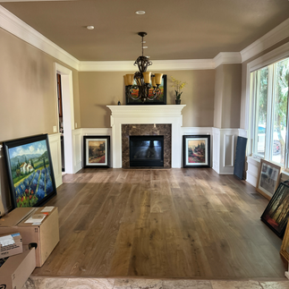


Before Photos: Entry, Living Room, Powder Bathroom and Family Room
Our clients, who have a deep appreciation for art, mood, and color, were excited to not only make their home feel more modern and timeless, but also infuse it with some much-needed color.
Specifically?
The rich, dramatic blues of a Pacific Northwest river at dusk.
Teal, burnt orange, charcoal, brass.
Colors with attitude.
Colors with soul.
Discovering a Love for Bold Color
The design direction revealed itself almost accidentally, as it often does. While exploring patterns, palettes, and textures, a theme emerged: a love of deep blues and oranges, grounded in organic neutrals.

From that spark, the rest of the home came to life.
Our clients were drawn to more modern styles, but the home’s architecture leaned traditional—so the challenge was to blend the two, creating a look that felt fresh and luxurious while still honoring its roots.
A Living Room Made for Long Conversations
We reimagined the living room as a TV-free gathering space centered around wine, firelight, and connection. Saturated blue upholstery and layered textures give the space depth and drama, while the wallpaper on the ceiling and warm furnishings elevate the overall mood.


Photographer: Genny Moller
Every detail, from material choices to the seating placement, was chosen with conversation and comfort in mind.
Water Lilies and Burnished Brass
In the dining room, visible from the entry and living room, we made our boldest move—a breathtaking wallpaper mural of water lilies, evoking the calm yet kinetic energy of a flowing river. We painted the surrounding wainscoting and ceiling in a deep charcoal blue to let the mural shine, while accents of burnished brass and warm walnut brought balance and warmth.


Photographer: Genny Moller
Even the ceiling medallion, with its subtle texture and tone-on-tone finish, reflects the care we took with every layer, enhancing the space without stealing the spotlight.
Small Moments, Big Impact
A warm neutral creamy paint color in the entryway lets the deeper tones of the living areas pop, while the thoughtfully styled entry table and burnished metal mirror create an inviting first impression. In the powder room, I couldn’t resist leaning into some high-contrast drama (powder rooms are perfect for drama!) with a wallpaper that nods to movement and nature.


A Family Room That Grounds the Design
While we went bold with the living and dining spaces, we took a quieter approach with the adjacent family room, which is layered with warmth, texture, and a more neutral overall palette but splashed with deeper tones.


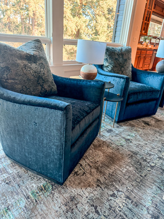
Custom furnishings allowed us to tailor the space to the family’s lifestyle—prioritizing durability without sacrificing design. A warm, light gray sofa anchors the room, while deep blue swivel chairs and charcoal blue leather lounge chairs bring just the right amount of color and contrast.
We also updated the main wall color throughout the home, replacing the original golden brown hue with a deeper creamier shade (Benjamin Moore Manchester Tan) that feels both fresh and timeless.
When Color Tells a Story
This project was a reminder of how powerful color can be. Not just for impact, but for creating emotional connection and energy in a space. The result is a home that feels cohesive, curated, and filled with warmth—even on the cloudiest Oregon day.
Ready to explore your own love for color?
Whether you’re drawn to soft earth tones or saturated jewel hues, there’s room to be bold in every home.


Comments